Brand
The Lailio brand book: logo, colours, typography, graphic language and web standards in one place.
Brand book
The Lailio brand, in one place.
A living reference for everyone working in Lailio's name: logo, colours, typography, graphic language, tone of voice and web standards. It is based on the official style guide and extended with the rules this website is built on.
01 · Logo
Approved logo versions
The horizontal logo is the primary version. Use the vertical logo in narrow, tall spaces and the icon only where the name is already visible. Each version comes for light and dark backgrounds, plus a black and white version for single-colour print.
 PNG
PNGHorizontal
Light background. Primary version.
 PNG
PNGHorizontal
Dark background. White type, white triangle.
 PNG
PNGVertical
Light background. For narrow, tall spaces.
 PNG
PNGVertical
Dark background.
 PNG
PNGIcon
Light background. Favicon, apps, avatar.
 PNG
PNGIcon
Dark background.
 PNG
PNGBlack and white horizontal
Single-colour print, engraving.
 PNG
PNGBlack and white horizontal
Dark background, outline.
 PNG
PNGBlack and white vertical
Single-colour print.
 PNG
PNGBlack and white vertical
Dark background, outline.
02 · Rules
Clear space and size
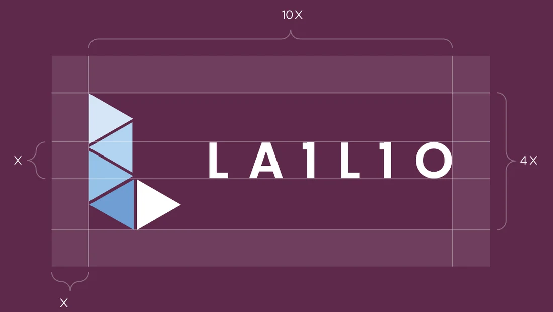
Clear space
The logo is built on a unit X. The logo is 4X high and 10X wide. Always keep a clear space of at least X on every side: no text, images or other elements may enter it.
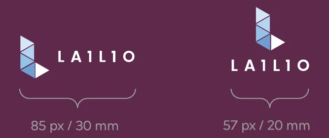
Minimum size
To keep the logo legible, never use it below the recommended size.
- Horizontal
- 85 px · 30 mm
- Vertical
- 57 px · 20 mm
Backgrounds
Use the standard logo on light backgrounds and the inverted version on dark and burgundy backgrounds. On photos, place the logo only on a calm, even area with enough contrast.
03 · Misuse
Never, ever use the logo like this
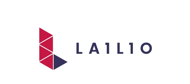
Never change the colours
The logo always uses the official colours or the approved inverted and black and white versions.
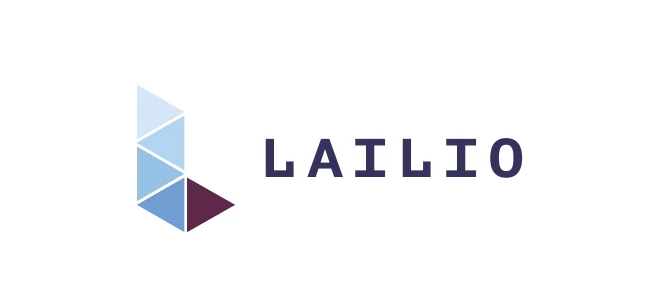
Never deform
Do not stretch, squeeze or skew the logo. Its proportions are fixed.
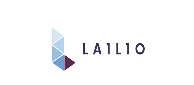
Never change the font
The letters are part of the mark. Never reset them in another typeface.
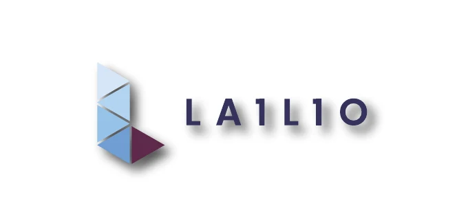
Never add effects
No shadows, glows, outlines or gradients.
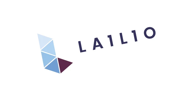
Never rotate
The logo is always horizontal or in its approved vertical version, never at an angle.
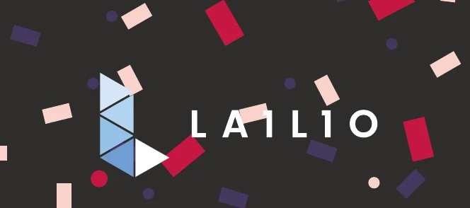
Never use on busy backgrounds
Busy, patterned or low-contrast backgrounds make the logo illegible.
04 · Colours
The official palette
Lailio uses these six colours only. Burgundy and navy carry the brand; the blue scale supports it. Each swatch shows the logo version that is approved on that colour.
Ice blue
Backgrounds, areas
- HEX
- #C9DDF2
- RGB
- 200/221/242
- CMYK
- 19/6/0/0
- Pantone
- 545 C
Light blue
Graphic elements
- HEX
- #A2CBEC
- RGB
- 161/203/236
- CMYK
- 34/9/0/0
- Pantone
- 277 C
Mid blue
Graphic elements
- HEX
- #86BBE2
- RGB
- 134/187/228
- CMYK
- 45/14/1/0
- Pantone
- 278 C
Lailio blue
Accent, links on dark backgrounds
- HEX
- #669ACD
- RGB
- 103/153/203
- CMYK
- 60/30/2/0
- Pantone
- 7453 C
Lailio burgundy
Primary brand colour, buttons, accents
- HEX
- #57274C
- RGB
- 87/38/76
- CMYK
- 58/88/36/41
- Pantone
- 262 C
Lailio navy
Headings, text, dark areas
- HEX
- #35325C
- RGB
- 53/50/91
- CMYK
- 87/85/33/30
- Pantone
- 5265 C
Tints and shades
Use lighter tints for backgrounds and highlights, darker shades for active states and text. Never use colours outside this scale.
05 · Typography
Two typefaces, clear roles
Poppins is the brand's voice in headings and advertising, often in capitals. Open Sans carries all body copy and stands in wherever Poppins is not available. Both fonts are self-hosted on the website, with no external requests.
Poppins
Smart solutions. Exceptional results.
- Light300
- Regular400
- Medium500
- Semi-Bold600
- Bold700
Open Sans
Body copy is set in Open Sans at a comfortable line height. Paragraphs are short, lead with the outcome and back claims with facts.
- Light300
- Regular400
- Semi-Bold600
- Bold700
Website heading scale
- H1Smart solutions. Exceptional results.
- H2Smart solutions. Exceptional results.
- H3Smart solutions. Exceptional results.
- H4Smart solutions. Exceptional results.
- H5Smart solutions. Exceptional results.
- H6Smart solutions. Exceptional results.
In print
Business card: name in Poppins Bold 10 pt, details in Poppins Light 6.5 pt. Letterhead footer: Poppins Light 7 pt.
06 · Graphic language
Triangles from the logo
The brand pattern is made of the same triangles as the logo. It adds movement and rhythm but never competes with the content.
- 01
Palette colours only
Triangles use the official colours only, never gradients.
- 02
White gap
There is always a thin white line between triangles.
- 03
Flat
No shadows, depth or transparency effects.
- 04
At the edges, not the centre
The pattern enters from a corner or an edge and leaves room for content and the logo.

07 · Web standards
How the brand lives on the website
These rules are built into the lailio.com code. They apply to every new page and component.
- 01
Flat design
No shadows, anywhere, ever. Depth comes from areas and lines, not shadows.
- 02
Sharp corners
No rounded corners: buttons, cards, images and forms are rectangles.
- 03
Hairlines
Blocks are separated by a 1 px #E2E8F0 line; cards sit in one frame without gaps.
- 04
Black for text only
Black is allowed for type only, never for lines or areas.
- 05
Visible focus
Keyboard focus is a 2 px burgundy outline, not a glow.
- 06
No long dashes
Use a colon or a comma in copy, never a long dash.
CSS variables
08 · Icons
Simple, without frames
The website uses Bootstrap Icons. Icons are line icons without background circles or frames, in burgundy or navy. Never recolour partner or third-party logos in brand colours.
09 · Tone of voice
How Lailio sounds
- 01
Clear over clever
Plain language and concrete outcomes. No buzzwords, no empty promises.
- 02
Think globally, act locally
Founded in Riga, working across Europe. We speak like an engineer who understands the client's business.
- 03
Always on
24/7 reliability is a promise, not a slogan. We back claims with numbers, SLAs and references.
- 04
In every language
Every text exists in all website languages. The base is Latvian or English, and translations read naturally.
10 · Applications
Print and merchandise
Formats, fonts and sizes from the official style guide.
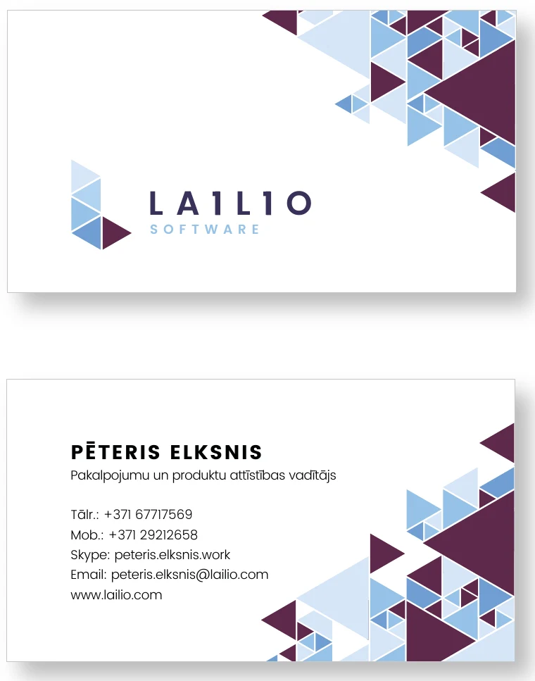
Business card90 × 50 mm · Poppins Bold 10 pt, Poppins Light 6.5 pt 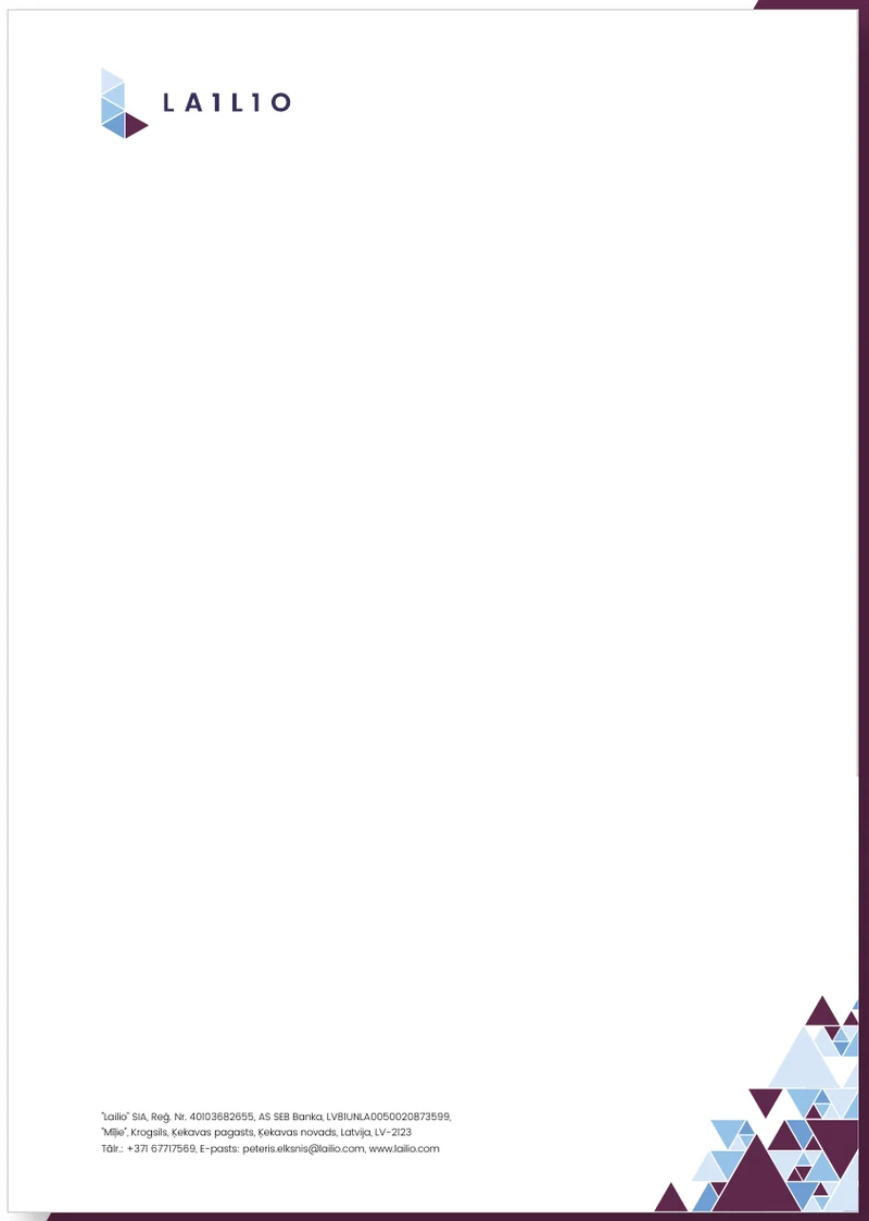
LetterheadA4, 210 × 297 mm · footer Poppins Light 7 pt 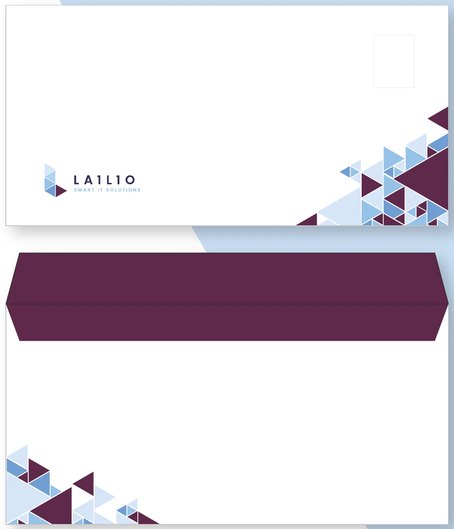
EnvelopeC65 · logo and triangle pattern 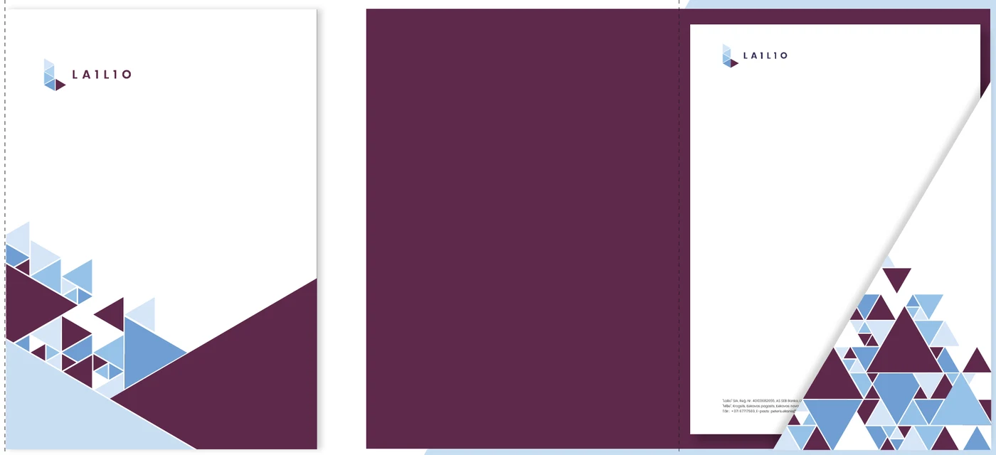
Folder225 × 320 mm · outside and inside 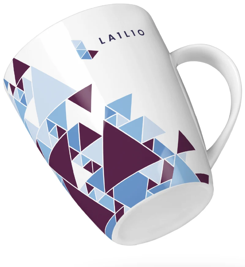
MugAll-over print with the triangle pattern 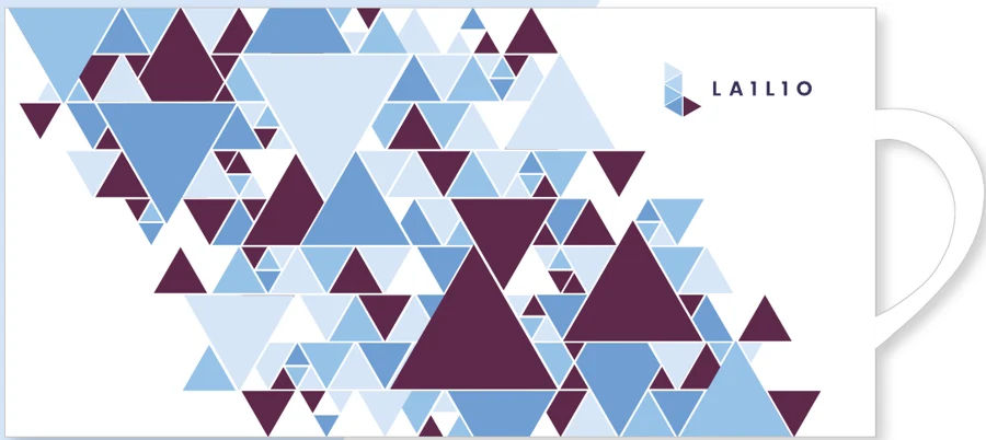
Mug print layoutPattern and logo on white 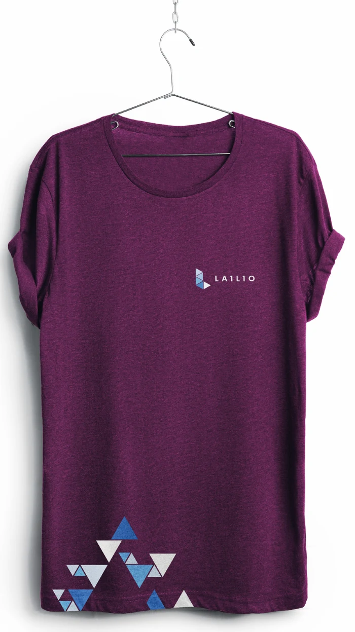
T-shirtBurgundy base, inverted logo 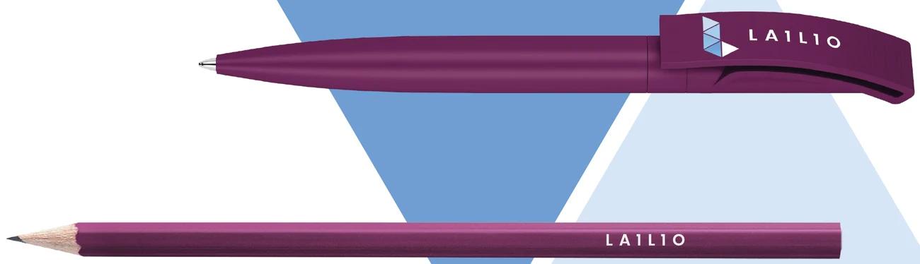
Pen and pencilBurgundy, inverted logo 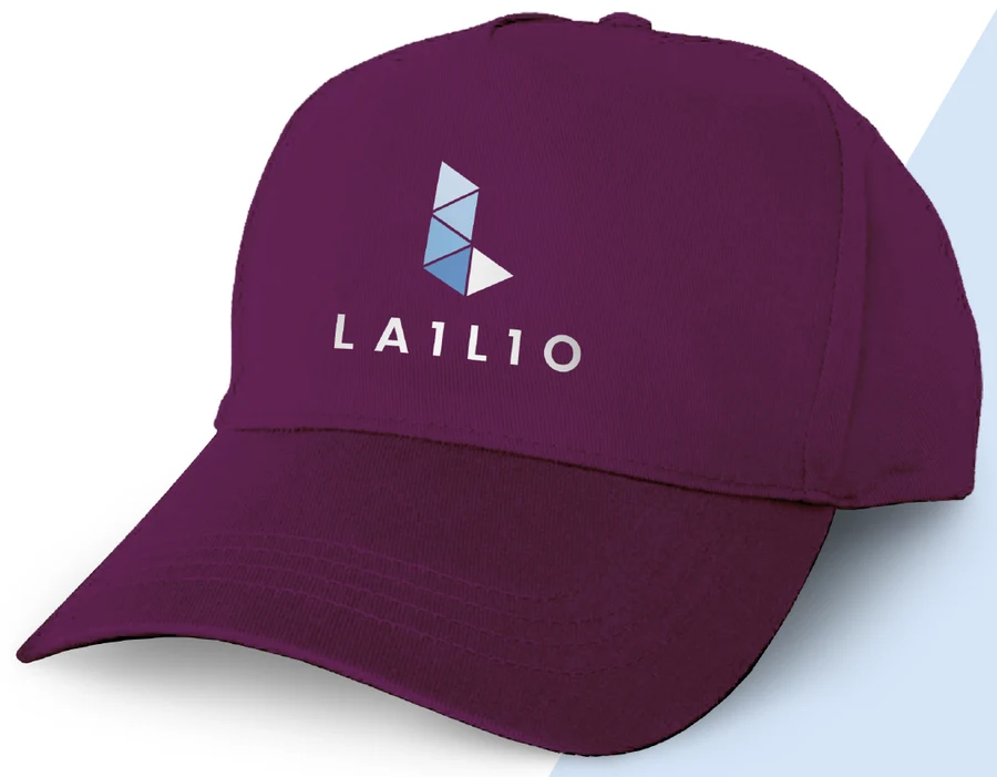
CapBurgundy, inverted vertical logo
Email signature
Name, role, phone, email and the horizontal logo. Compact, in brand fonts, with no other images.
11 · Downloads